Making a spinner
Computers make us wait. A lot. Every time I look at a progress bar I ask myself what went wrong — the machines are incredibly more powerful than, say, two decades ago, and yet we spend a similar amount of time waiting for seemingly trivial tasks to complete.
But this is not a post about the state of computing! Let's create a simple spinner animation to brighten the user's mood while they wait for their cat photos to upload. Here's a video of what the spinner is supposed to look like:
As you can see, we have twelve segments that cycle their brightness with a slight time offset, giving the impression of circular motion. We could create this effect using <div> tags, but let's use something that is purpose-built for graphic work: SVG.
I've recently invested in copies of Affinity Designer and Photo, and it's been so much fun to play with graphics again (I stopped paying Adobe when they went the subscription model). So, fire off your vector graphics tool of choice: Inkscape is great (and free), Affinity Designer, Adobe Illustrator, or some other, and let's do some really complex drawing. The process below uses Affinity Designer, but it's totally achievable using other tools.
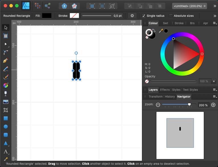
Let's start with a small square canvas; I used 400×400.
We'll add a rounded rectangle, 10 pixels wide by 30 tall, horizontally centered in the canvas and vertically offset 40px from the horizontal centre line. These measurements aren't critical; the important part is to center the rectangle horizontally and have it somewhat above the middle.
I used the special rounded rectangle control point to make the caps fully rounded, and made sure there was no stroke on the shape, just the black fill colour. Change according to need.
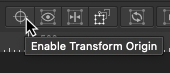
So here is the most exciting part of this drawing: by default, when transforming a shape the origin of the transform will be the shape center (e.g. if you rotate, it will rotate about the center). We can change this, however. In Affinity Designer we can toggle "Enable Transform Origin" on the toolbar.
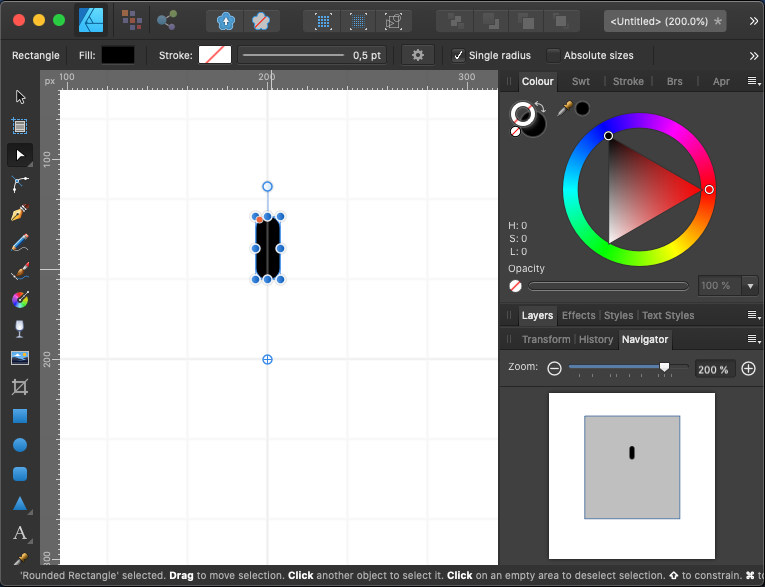
We now get an extra point that looks like crosshairs when selecting the shape. Dragging this point will change the origin of future transforms applied to the shape. Let's drag the point to the exact centre of the canvas, which should be directly below the shape.
All is set; we can now duplicate the shape and apply a rotation. Since we have twelve segments, each segment needs to be rotated 30 degrees further along the central axis (12 × 30° = 360°).
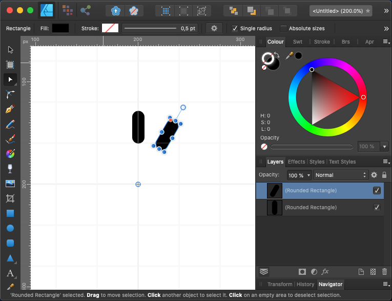
This can be done manually segment-by-segment by duplicating the latest one and rotating. In Designer I found a neat trick: start by duplicating a shape (Cmd+J, or from the Edit > Duplicate menu) and then apply a transform (in this case, rotate 30 degrees); if you then duplicate the shape again it will reapply the transform. So the whole process consisted of: Cmd+J, rotate, Cmd+J, Cmd+J, … 10 times.
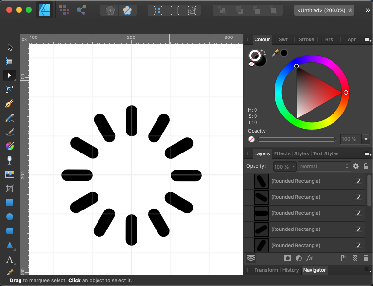
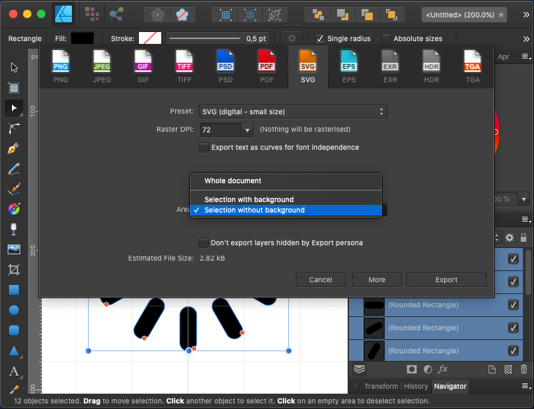
Once we have this basic drawing, we can export it to SVG. To make sure we don't have to deal with viewbox later on, let's select all the segments and export just them, not the whole canvas:
Opening the resulting file in a text editor will show something like this:
<?xml version="1.0" … ?>
<svg width="100%" … >
  <path d="M85,5c-0,-2.76 …" />
  <path d="M121.83,17.548 …" />
  <path d="M147.452,46.83 …" />
  <path d="M155,85c2.76,- …" />
  <path d="M142.452,121.8 …" />
  <path d="M113.17,147.45 …" />
  <path d="M75,155c0,2.76 …" />
  <path d="M38.17,142.452 …" />
  <path d="M12.548,113.17 …" />
  <path d="M5,75c-2.76,0  …" />
  <path d="M17.548,38.17c …" />
  <path d="M46.83,12.548c …" />
</svg>
This code could be used as-is (the important part are the several <path> elements), but it's good practice to clean up a bit. I pasted the code into the SVGOMG online tool, and unchecked the "Merge paths" option (we want separate <path> elements so we can animate them individually).
Below is the cleaned up code I got back:
<svg viewBox="0 0 160 160" fill="#000">
  <path d="M85 5c0-2.76-2.24-5-5-5s-5 2.24-5 5v20c0 2.76 2.24 5 5 5s5-2.24 5-5V5z"/>
  <path d="M121.83 17.548c1.38-2.39.56-5.45-1.83-6.83a5.002 5.002 0 00-6.83 1.83l-10 17.321a5.002 5.002 0 001.83 6.83 5.003 5.003 0 006.83-1.83l10-17.321z"/>
  <path d="M147.452 46.83a5.002 5.002 0 001.83-6.83 5.002 5.002 0 00-6.83-1.83l-17.321 10a5.003 5.003 0 00-1.83 6.83 5.002 5.002 0 006.83 1.83l17.321-10z"/>
  <path d="M155 85c2.76 0 5-2.24 5-5s-2.24-5-5-5h-20c-2.76 0-5 2.24-5 5s2.24 5 5 5h20z"/>
  <path d="M142.452 121.83c2.39 1.38 5.45.56 6.83-1.83s.56-5.45-1.83-6.83l-17.321-10a5.002 5.002 0 00-6.83 1.83 5.003 5.003 0 001.83 6.83l17.321 10z"/>
  <path d="M113.17 147.452a5.002 5.002 0 006.83 1.83 5.002 5.002 0 001.83-6.83l-10-17.321a5.003 5.003 0 00-6.83-1.83 5.002 5.002 0 00-1.83 6.83l10 17.321z"/>
  <path d="M75 155c0 2.76 2.24 5 5 5s5-2.24 5-5v-20c0-2.76-2.24-5-5-5s-5 2.24-5 5v20z"/>
  <path d="M38.17 142.452a5.002 5.002 0 001.83 6.83c2.39 1.38 5.45.56 6.83-1.83l10-17.321a5.002 5.002 0 00-1.83-6.83 5.003 5.003 0 00-6.83 1.83l-10 17.321z"/>
  <path d="M12.548 113.17a5.002 5.002 0 00-1.83 6.83 5.002 5.002 0 006.83 1.83l17.321-10a5.003 5.003 0 001.83-6.83 5.002 5.002 0 00-6.83-1.83l-17.321 10z"/>
  <path d="M5 75c-2.76 0-5 2.24-5 5s2.24 5 5 5h20c2.76 0 5-2.24 5-5s-2.24-5-5-5H5z"/>
  <path d="M17.548 38.17a5.002 5.002 0 00-6.83 1.83 5.002 5.002 0 001.83 6.83l17.321 10a5.002 5.002 0 006.83-1.83 5.003 5.003 0 00-1.83-6.83l-17.321-10z"/>
  <path d="M46.83 12.548a5.002 5.002 0 00-6.83-1.83 5.002 5.002 0 00-1.83 6.83l10 17.321a5.003 5.003 0 006.83 1.83 5.002 5.002 0 001.83-6.83l-10-17.321z"/>
</svg>
We now need to add some CSS to animate the segments. Exactly how this should be done depends a bit on how we want to use the final spinner.
If we are building a React/Angular/Vue component, or in some other way embedding the SVG directly into a HTML document, it might be best to write the CSS separately in a stylesheet file. However, if we want the spinner to work as a standalone external image (to be included via <img src="spinner.svg" />) we must write the CSS in the same file as the SVG. This is because the SVG will not be a direct part of the document, and as such CSS rules will not cascade from the HTML into the linked SVG document.
In any case, this is mostly a matter of placing the CSS in the place that is most sensible for your requirements; the code itself is largely the same. For this example, let's create a fully standalone spinner file, with embedded CSS.
We are going to start by writing the CSS animation that will be applied to each <path> segment. To see how this should work, let's zoom in on a single segment in the video above, and slow it down:
The segment seems to be fully opaque and then gradually fade to about 25% opacity for most of the cycle. Towards the end, though, it holds that 25% opacity for a while before jumping back to 100% and repeating. Why am I mentioning opacity instead of a plain colour transition? A few reasons:
- Opacity allows us to use a different base colour for the spinner segments (e.g. white for a dark background; black for a light background)
- It's a property that can be relied to animate in a performant way
- It works well over non-plain backgrounds (e.g. an image)
A simple animation for this effect would look like this:
@keyframes fade {
  0% {
    opacity: 1;
  }
  66% {
    opacity: 0.25;
  }
  100% {
    opacity: 0.25;
  }
}
And here is what that looks like, live in your browser, applied to a simple <div>:
Let's add this to our SVG file and animate the path segments. Since SVG is XML, we should wrap the CSS code in a CDATA section.
<svg viewBox="0 0 160 160" fill="#000">
  <style type="text/css">
    <![CDATA[
    @keyframes fade {
      0% { opacity: 1; }
      66% { opacity: .25; }
      100% { opacity: .25; }
    }

    path {
      animation: fade 1s infinite;
      opacity: .25;
    }
    ]]>
  </style>
  <path … />
  …
</svg>
Here is what the SVG file looks like right now:

Flashy! Most of the work is actually done now — all we need to do is make each segment animate with different start-up delays. How do we do that? CSS has exactly the right property for this: animation-delay. This offsets the start of the animation by a given time. If we add a different delay for each path segment we should be able to get the "spinning" effect.
Since we have twelve segments and we set the animation duration to one second, we can delay each segment by 1/12th of a second or 0.0833 seconds further than the previous. This will make the last segment start the animation just as the first segment is about to finish it (and restart). We can calculate this manually, of course:
path:nth-child(2) {
  animation-delay: 0.833s;
}
path:nth-child(3) {
  animation-delay: 1.666s;
}
path:nth-child(4) {
  animation-delay: 2.499s;
}
/* etc… */
It would be best to have the computer do the calculating for us, though. The formula is very simple. First, we need the delay offset to be added to each segment (0.833s in this case):
delayOffset = totalDuration / segmentCount;Then, for each segment, we calculate the applicable delay:
currentSegmentDelay = previousSegmentDelay + delayOffset;Let's use CSS variables (AKA "custom properties") to keep track of the magic numbers. Using variables should also make it easier to adjust the animation duration, or the number of segments, if we change the SVG.
:root {
  --totalDuration: 1s;
  --segmentCount: 12;
  --delayOffset: calc(var(--totalDuration) / var(--segmentCount));
}
We still need to declare the delays for all the segments, but we can now do it using an expression. Maybe we can simply have an accumulator variable, and increment it on each segment:
:root {
  --segmentDelay: 0; /* initialisation */
}

path {
  --segmentDelay: calc(var(--segmentDelay) + var(--delayOffset)); /* 😱 nope */
  animation-delay: var(--segmentDelay);
}
Unfortunately, this doesn't work — by design, CSS variables cannot have dependency cycles like x = x + 1, so that declaration is ignored and --segmentDelay stays permanentely set to 0. We need an extra variable that changes on every path segment — we already declare each segment as a <path> element, so that's an easy place to also declare this new variable, this time using inline styling:
<?xml version="1.0" … ?>
<svg width="100%" … >
  <path style="--idx: 0" d="M85, …" />
  <path style="--idx: 1" d="M121 …" />
  <path style="--idx: 2" d="M147 …" />
  <!-- etc… -->
</svg>
We can now write our animation-delay formula quite concisely:
path {
  animation-delay: calc(var(--delayOffset) * var(--idx));
}
And here is the final version of our spinner SVG, with an extra --fadedOpacity CSS variable for good measure:
<svg viewBox="0 0 72 72" xmlns="http://www.w3.org/2000/svg">
  <path style="--idx: 0" d="M38.984 3.001A3.003 3.003 0 0035.983 0a3.003 3.003 0 00-3.001 3.001v9.981a3.002 3.002 0 006.002 0V3.001z"/>
  <path style="--idx: 1" d="M55.085 8.928a3.003 3.003 0 00-1.097-4.1 3.003 3.003 0 00-4.1 1.097l-4.994 8.642a3.002 3.002 0 001.096 4.1 3.003 3.003 0 004.1-1.097l4.995-8.642z"/>
  <path style="--idx: 2" d="M66.059 22.116a3.002 3.002 0 00-2.997-5.2l-8.648 4.983A3.002 3.002 0 0057.41 27.1l8.649-4.984z"/>
  <path style="--idx: 3" d="M68.962 39.026a3.002 3.002 0 00.007-6.002l-9.981-.013a3.002 3.002 0 00-.008 6.002l9.982.013z"/>
  <path style="--idx: 4" d="M63.015 55.119c1.433.83 3.27.341 4.101-1.092a3.003 3.003 0 00-1.092-4.101l-8.636-5.005a3.002 3.002 0 00-3.009 5.192l8.636 5.006z"/>
  <path style="--idx: 5" d="M49.813 66.076a3.002 3.002 0 004.097 1.107 3.002 3.002 0 001.107-4.097l-4.973-8.654a3.002 3.002 0 00-5.204 2.99l4.973 8.654z"/>
  <path style="--idx: 6" d="M32.9 68.958a3.002 3.002 0 006.002.015l.025-9.981a3.003 3.003 0 00-2.994-3.009 3.003 3.003 0 00-3.008 2.994l-.025 9.981z"/>
  <path style="--idx: 7" d="M16.814 62.991a3.002 3.002 0 005.189 3.016l5.016-8.63a3 3 0 00-5.189-3.016l-5.016 8.63z"/>
  <path style="--idx: 8" d="M5.873 49.776a3.002 3.002 0 002.984 5.207l8.66-4.962a3 3 0 10-2.983-5.207l-8.661 4.962z"/>
  <path style="--idx: 9" d="M3.012 32.859a3.002 3.002 0 00-.022 6.002l9.981.037a3.002 3.002 0 00.023-6.002l-9.982-.037z"/>
  <path style="--idx: 10" d="M9 16.781a3.002 3.002 0 00-4.104 1.081 3.002 3.002 0 001.081 4.104l8.623 5.027a3.001 3.001 0 003.023-5.185L9 16.781z"/>
  <path style="--idx: 11" d="M22.229 5.856a3.002 3.002 0 00-5.212 2.977l4.951 8.667a3.002 3.002 0 005.212-2.977l-4.951-8.667z"/>

  <style type="text/css">
  <![CDATA[

    :root {
      --fadedOpacity: .2;
      --segmentCount: 12;
      --totalDuration: 1s;
      --delayOffset: calc(var(--totalDuration) / var(--segmentCount));
    }

    @keyframes fade {
      0% {
        opacity: 1;
      }

      66% {
        opacity: var(--fadedOpacity);
      }

      100% {
        opacity: var(--fadedOpacity);
      }
    }

    path {
      animation: fade var(--totalDuration) infinite;
      animation-delay: calc(var(--delayOffset) * var(--idx));
      opacity: var(--fadedOpacity);
    }

  ]]>
  </style>
</svg>